“We Make Data More Vivid, Beautiful, Intuitive and Memorable.”

Jeff, you start Signals noting there are more points of data in existence “than there are stars in the known universe.” This statement sets up the problem business leaders, entrepreneurs and investors face when trying to make decisions about where to put their time, energy and money. How did you choose the 27 signals you highlight in your book as major trends? Why this data? How did you decide?
Every year, the Visual Capitalist team sifts through tens of thousands of data series on a variety of trends across multiple industries, disciplines, and fields. For the book Signals, our editors, writers and researchers systematically dug through this data, identifying the clear and most impactful megatrend themes that the data relate most to. But it’s not just enough to be a megatrend. For it to be featured as a signal in the book, it needed to be as objective as possible: come from numerous sources with consensus confirming the megatrend, be fairly ubiquitous and wide-reaching, quantifiable, and it had to have a proven history of occurring in the past and projections confirming it to continue happening in the future. Think of the latter constraint as Nassim Taleb’s “Lindy effect.” The longer something is happening, the more it is likely to continue to happen. The 27 trends we landed on hit all these criteria.
How does presenting data visually help to separate the “signal” from the noise? Does this appeal to a different part of the brain? How is it that people can comprehend complex issues so much easier by visualizing them?
In many everyday life situations, we are tasked mentally with trying to separate the signal from the noise, and this is extremely taxing on human cognition. Specifically, it leads to the “information overload” problem, a situation where we have more information at hand, but our decision-making quality actually decreases! So really it’s a two-part process for us. First, by breaking up the signal – the data that best “proves” the premise of a megatrend, from the noise – everything else – we are able to isolate what is interesting and compelling. It’s about making a logical case that something is happening and we should pay attention to its second-order effects. Second, by visualizing it, we are using data storytelling, which is the combination of data, visuals and narrative, to communicate it in the most effective possible form to readers.
The majority of people describe themselves as visual learners, and are more likely to remember something this way.
Jeff Desjardins, Founder and Editor-In-Chief of Visual Capitalist
We try to do our data storytelling in a consistent way throughout the book using a replicable format in each “signal” and chapter, in order to make it even easier to follow for the reader.
By presenting ‘the big picture,’ are you sort of finding a shortcut to the brain? Is the information presented visually easier to absorb and retain?
I don’t think the big picture view is necessarily a shortcut for everyone, although it does help for a certain type of thinker, and specifically many business thinkers and leaders. I do think that isolating a clear narrative with a compelling data set does make it easier to wrap one’s head around it. It gives a single focal point for the brain to process, rather than the hundreds of related trends you could look at. Then, by using visual storytelling, we make it more vivid, beautiful, intuitive and memorable. We use the Seth Godin model for understanding communication in modern media, in which there are only two currencies: attention and trust. The data, sources and our reputation create trust, and the visuals help work to capture and retain attention.
You present a macro context for global trends and change, looking at the global economy within social and demographic trends. And each infographic is a wonderful rabbit hole unto itself. I’m thinking of your infographic of the average age in different countries, ranging from 18 in African countries to 47 in Japan. Generally, you show a global aging trend. What is the “silver economy?” What are some of its characteristics that investors or business leaders might be paying attention to?
There are rabbit holes everywhere! Signals is meant to help create the base foundation of knowledge for what’s changing in the world. That’s a bold goal, but I think we achieve it to some extent. But yes, in any given signal, one can dive much deeper and find all sorts of interesting tangents, and of course, some people will be more focused on certain signals than others.
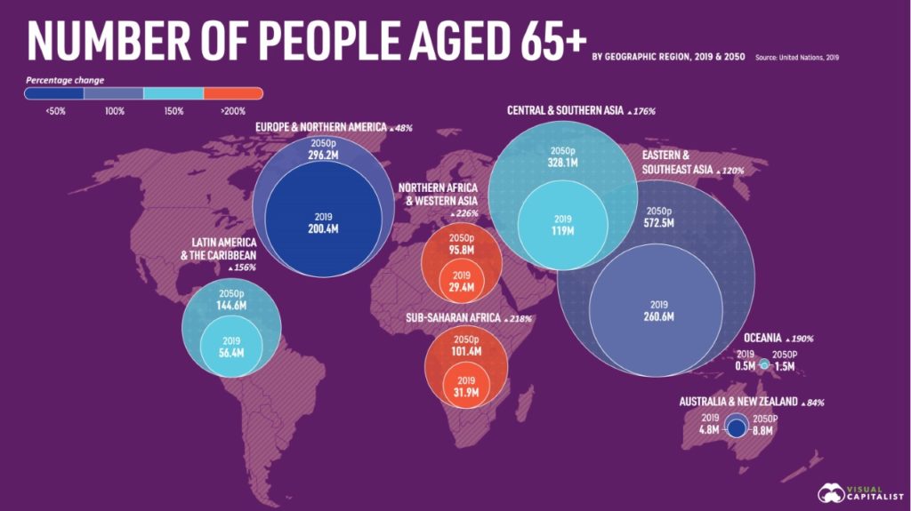
The Silver Economy is the growing collection of products and services catering specifically to older generations across a number of segments.
Jeff Desjardins
This is not surprising, because Baby Boomers are the biggest generation by far in terms of spending power and wealth, and people are living longer and are more healthy. An aging population impacts every sector, and sectors have to change how they market their goods and services as a result. Over the next 15 years, you’ll see everything from travel to healthcare marketed in ways you’ve never seen before.
Another macro context is worldwide digital transformation. You focus on algorithms, so, the way people process large amounts of data, and also on media decentralization, a trend in the way information is disseminated. These snapshots of data, taken together, tell a story of the shift from a few trusted print sources to a plethora of streaming and social sources. What are some observations you can distill – whether obstacles or opportunities – from these trends?
This is an area we think a lot about, specifically around the evolution of media and communication. The most interesting opportunity we see here is the decentralization of trust and data verification in media. Imagine if news was completely data-driven, and you could look at that data transparently while being able to instantaneously verify its validity and source. Opinions are important, but when they are chosen algorithmically by the technological powers that be, we are put in a situation where engagement – outrage, biases, etc. – are driving conversations, rather than the data itself. In short, I want to see a base layer of data-driven, transparent, verifiable, decentralized data that can be available to all. Then opinions can be built on that. This is one of the things we are working on.
Has the pandemic shaped or changed some of these signals in ways you didn’t necessarily predict? That were perhaps unpredictable? For instance, migration to cities?
Because we knew Signals would be published during the pandemic, we had to be very careful with how we selected our signals and chapters. Generally, we leaned into areas where we thought the trends — if anything — would be accelerated by the pandemic.
Certainly movement to cities, increasing global debt, increased technological adoption, rising wealth inequality, and peak globalization are some topics that have been accelerated by COVID-19 and subsequent government actions.
Jeff Desjardins
But now, we are also moving into the aftermath of many of these policy decisions made during COVID-19, which may impact the short-term implications of some of our megatrends. One example is we have a signal showing the 700-year trend of falling interest rates. Rates have recently increased (to still only a fraction of historical highs), but this is likely only a short-term blip.
What about natural disasters, which are also unpredictable?
Natural disasters are unpredictable as one-off events, but in aggregate there are larger trends that can be spotted. Some scientists have created compelling data that climate-related natural disasters are increasing in frequency and severity, for example. And this encompasses a bunch of areas including floods, droughts, hurricanes, etc.
Are you using algorithms and AI in your process as a way to keep track of these trends or flag changes in direction?
We base some topics we focus on for our website and our free daily email based on audience interest and action. These are not automated per se, but there is a data-driven and analytics element to understanding what is driving interest at any given moment.
What might be some shortcomings or limitations of exclusively using data to forecast, if any?
The biggest limitation we see is that to be included as a signal, data had to have a historical track record of occurring. By definition, this misses out on emerging trends that have not developed that type of track record yet. The problem is there is no objective way of looking at many of these emerging trends and knowing what will be globally significant in 10 or 20 years. We believe this is best left to subject matter experts, and even then, those experts do have very mixed results in predicting the future. Take it all with a grain of salt!
Two other limitations worth noting:
1. Not all meaningful trends can be summed up with one strong data set. I think Blockchain/Web3 is a good example of this. We weren’t able to isolate the perfect data set that met Signals criteria to show its future impact on the global economy. We found many smaller and isolated data sets that spoke to the emergence of the blockchain as being meaningful, but nothing that summed up the potential wide-reaching impacts.
2. Parts of every process are qualitative, involving human decision, biases, and emotions somewhere. It’s impossible to be quantitative in every single aspect, though obviously that’s what we aimed for.
About the Author
Author Jeff Desjardins is the Founder and Editor-In-Chief of the digital media company Visual Capitalist. Follow Jeff on Twitter @VisualCap.
How the Journal Saves You Time
Reading Time
9
min.
Reading time for this article is about 9 minutes.
Saved Time
6
h
This article saves you up to 6 hours of research and reading time.
Researched Abstracts
1
We have curated the most actionable insights from one summary for this feature.
1
We read and summarized one book with 272 pages for this article.